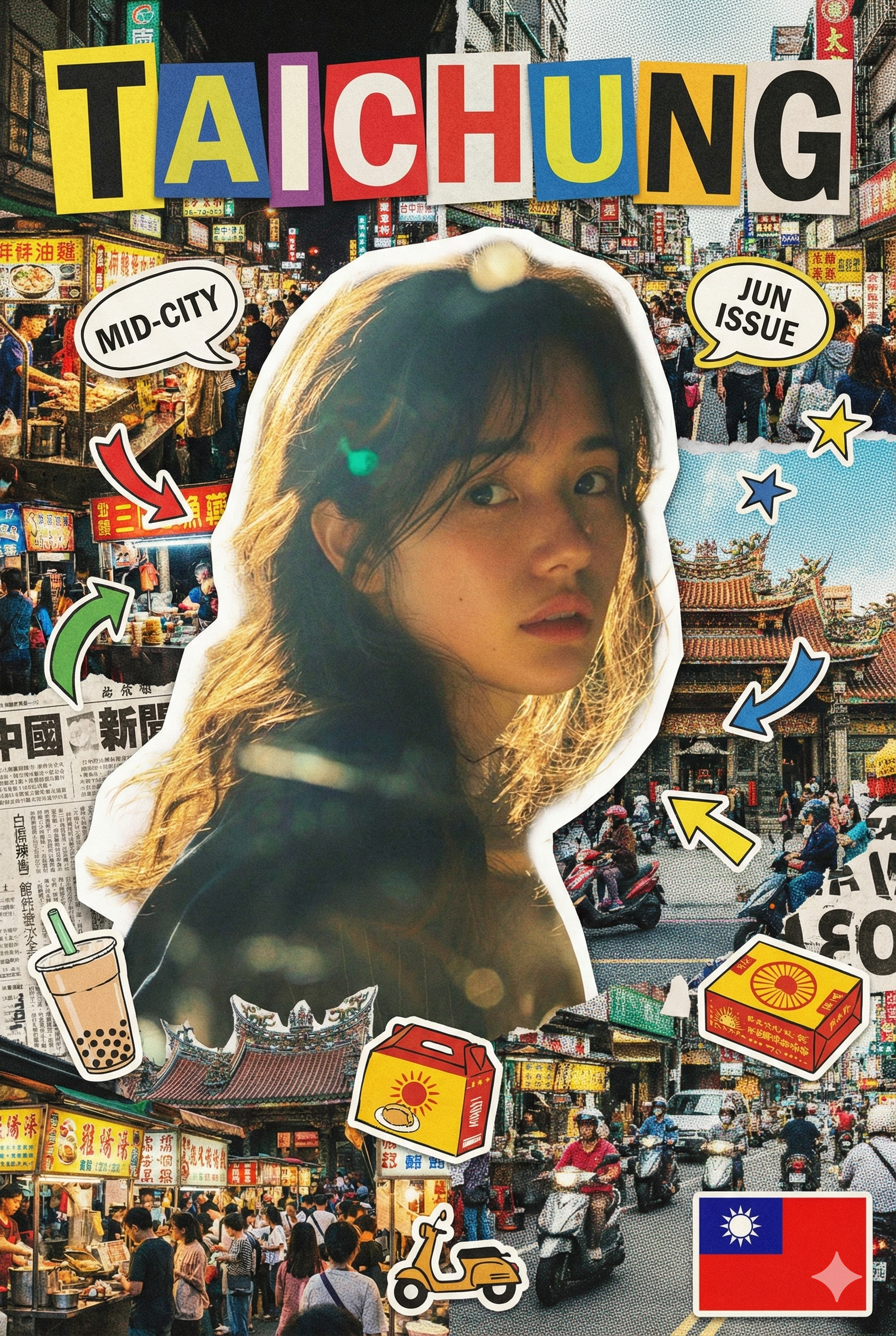
讓你的城市登上雜誌封面吧✨

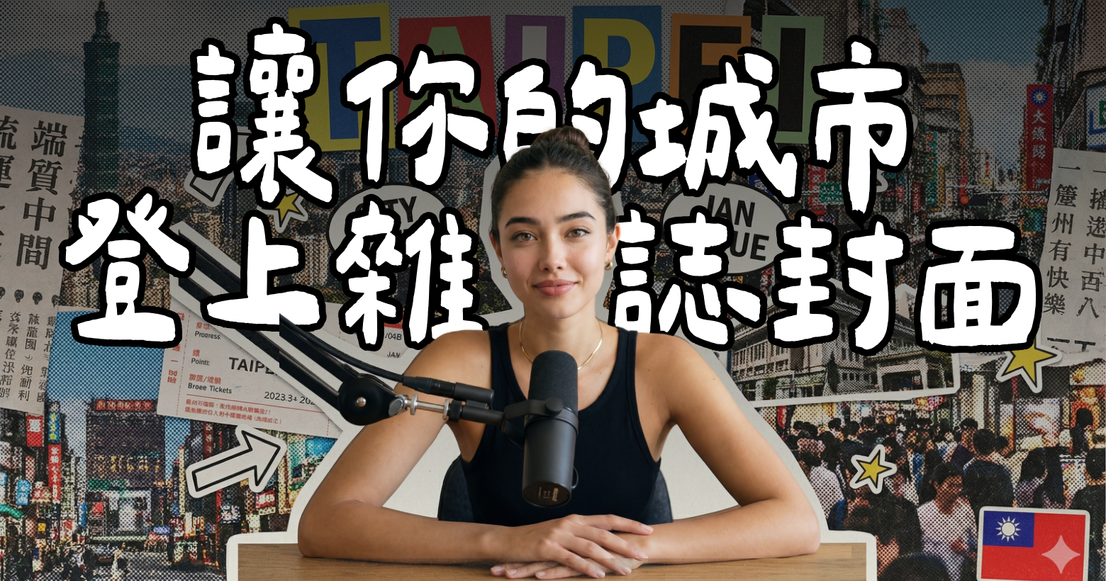
想把自己的城市做成雜誌封面嗎⤵️今天來分享這個『愛台灣』的Gemini指令!

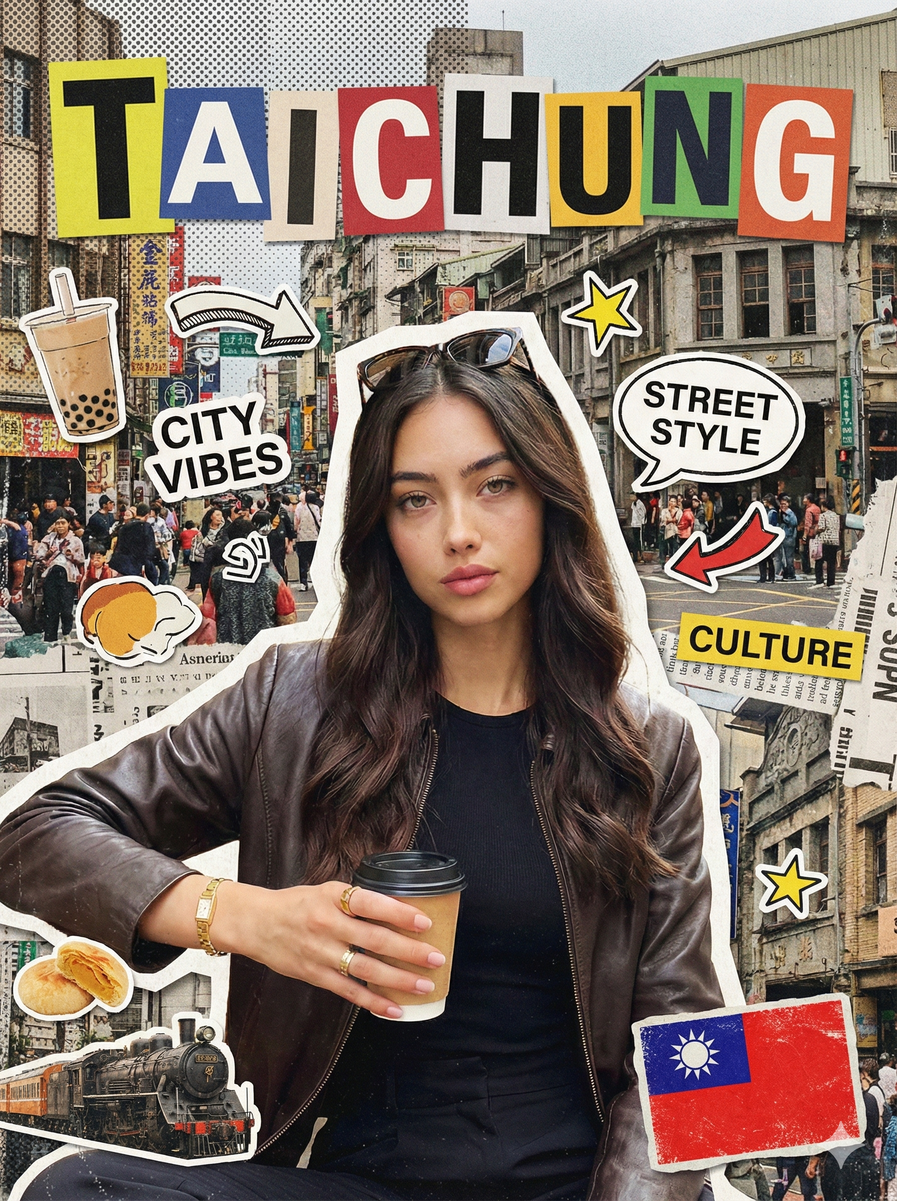
CITY NAME: {請在這邊輸入中文城市名}
CITY NAME RULE:
– The city name is provided in Chinese.
– Convert it to its commonly accepted English city name.
– Use the English city name as the main magazine title.
– Display the English city name in ALL CAPS.
– Do NOT display the Chinese city name anywhere on the cover.
OUTPUT SIZE:
– Final image size must be 1080 x 1440 pixels (vertical).
Create a bold analog-style city magazine cover inspired by hand-cut editorial collage aesthetics.
Use the uploaded portrait as the main subject.
Keep the person fully realistic and clearly recognizable.
Do NOT beautify, smooth, stylize, or modernize the subject in any way.
STYLE DIRECTION (VERY IMPORTANT):
The overall style must resemble a physical magazine collage made from cut paper, printed photos, newspapers, and stickers.
Avoid clean digital design, UI layouts, vector graphics, or modern poster aesthetics.
SUBJECT TREATMENT:
– Cut the subject out with slightly rough, imperfect scissor-cut edges.
– Add a visible white or off-white paper cutout border around the subject.
– The subject should appear pasted on top of the background, not blended into it.
BACKGROUND:
– Use layered city imagery inspired by TAITUNG, including street scenes, daily life, atmosphere, textures, and typography fragments.
– Apply subtle halftone dots, grain, paper texture, and print noise.
– The background should feel busy, imperfect, and layered, like overlapping magazine pages.
TYPOGRAPHY (KEY):
– Display “TAITUNG” as large, bold magazine letters at the top of the cover.
– Each letter must appear on its own colored paper block.
– Letters should be slightly misaligned and uneven.
– Typography should feel cut, pasted, and physical — not digitally typeset.
– Use bold, playful, magazine-style lettering, not modern fonts.
GRAPHIC ELEMENTS:
– Add printed-style stickers, arrows, stars, speech bubbles, labels, and small graphic cutouts.
– These elements must look printed, scanned, or pasted.
– Allow overlap and visual chaos, but keep the subject’s face fully readable.
TAIWAN FLAG:
– Include one small Taiwan flag.
– Render it as a sticker or printed badge.
– Place it in one bottom corner only.
– The flag must feel textured and part of the collage, not flat or digital.
COLOR & TEXTURE:
– Use saturated but slightly muted print colors (yellow, green, red, blue).
– Avoid clean gradients, flat vector fills, or glossy effects.
– Embrace imperfections: grain, paper fibers, uneven edges, print noise.
CITY DETAIL DECORATIONS:
– Add 2 to 4 small cut-out decorative elements representing TAITUNG.
– Elements should reflect local characteristics such as daily life, street culture, food, transportation, or atmosphere.
– Keep them symbolic, simplified, and magazine-style.
DESIGN RULES FOR CITY ELEMENTS:
– Each element must be fully cut out with no background.
– Elements should feel like stickers or magazine clippings.
– Place them around edges, corners, or near text blocks.
– Do NOT overlap or cover the subject’s face.
– These elements should support the city identity, not dominate the layout.
FINAL FEEL:
The final image must look like a photographed physical magazine cover collage,
not a digitally designed poster or social media template.
踏啦~馬上就能生成城市雜誌封面啦!快去試試看吧~